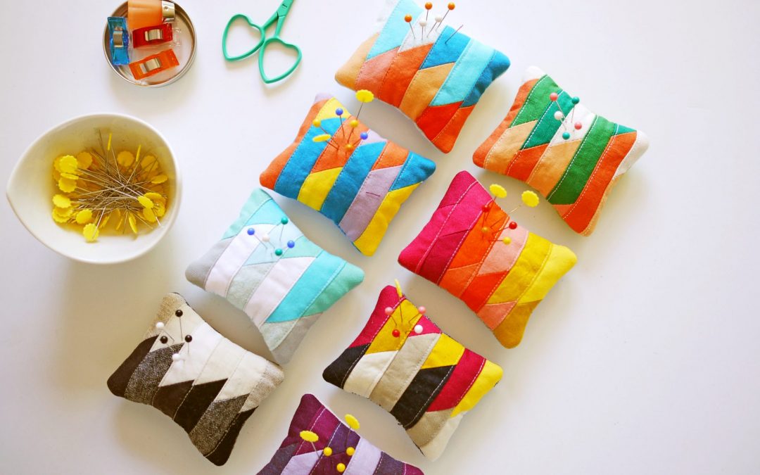
I have been following Amanda Jean Nyberg of Crazy Mom Quilts for a little while now, and I have seen her produce pin cushions on a daily basis. What a great way to use up scraps. I was particularly enamoured with Day 8 of this current round of production and made one for myself. And then I thought it was SO cute — and I am not one to gush about cuteness. But this was REALLY cute. So I made seven more as tiny quick colour studies. (Remember Lucy Engel’’ Quilt Prints?)

This Colour Theory series came out at 3″ x 3.5” each. Using short 1″ stripes from a bag of solid scraps, each illustrates colour schemes of basic colour theory. I will post a tutorial for the pincushions in the next couple of weeks (here it is). But for now, I’d like to provide you with an illustrated glossary of terms that will help you articulate your thoughts and preferences around colour. A glossary illustrated with pincushions, that is. Why is it important to be able to articulate in words how and what you think about colour? Because it helps you make conscious design choices, whether you are selecting fabric for a quilt, putting together an outfit, or decorating a room. (Please note that this is not by no means exhaustive list of terms; it is meant to give you a start.) First, let’s start with a CMY (Cyan, Magenta, Yellow) colour wheel. Sign up for the newsletter if you would like a printable PDF of the colour wheel.
HUE is the name of a colour, such as purple. A MONOCHROMATIC colour scheme uses one hue in various tints and shades, illustrated by the purple pincushion below.

INTENSITY or SATURATION is the purity of colour that determines its brightness or dullness. The pincushion below uses only WARM colours and is very SATURATED.

A TINT is a colour with the addition of white, such as baby blue. A SHADE is colour with the addition of black, such as maroon. When you lighten or darken a colour with white or black, they become MUTED – the opposite of saturated. The colour scheme of the pincushion below is made up of COOL colours, and MUTED in tone.

An ANALOGOUS colour palette uses colours that are adjacent to each other on the colour wheel. The WARM colours in the pincushion to the right are ANALOGOUS. With the purple next to it, the whole composition of the photo also uses an ANALOGOUS colour scheme.

A NEUTRAL colour scheme is made up of white, black, and gray. Often neutral colours like white and gray have a temperature – warm or cool. The whites in the pincushion below are warm in temperature, with a slight it of yellow in them. This is another example of a MONOCHROMATIC colour scheme.

COMPLEMENTARY colours are directly across from each other on the colour wheel, such as blue and orange (below, top). SPLIT COMPLEMENTARY colours are indirectly across from each other on the colour wheel, such as the green/pink/orange pincushion at the bottom of the photo.

TRIADIC colour schemes loosely form a equilateral triangle when you connect them in a colour wheel, such as the three primary colours (pincushion to the left, below) or three secondary colours. A QUADRATIC colour schemes forms a rectangle or square, as in the purple, blue, yellow and orange pincushion.

There are multitude of words and ways to talk about colour, and I could go on for a long time about the relationships and proportions of colour as well, but I’ll save that for another day. I think I will have to give names to these very cute pincushions.
They’re wonderful! Since they look like art I vote for calling them “The Group of Eight”
“The Group of Eight” — clever! Thanks, Karen!
Refreshing change after working on larger projects AND formalizing/educating us about color. There is much more to having a “sense of color.”
Anxious for the tutorials….hope to see it soon.
Thank you, Lois! Glad you found the post informative. There are lots of creative pursuits that people think are a matter of having intuition or innate talent such as an eye for colour or drawing, but I’m certain that they can be taught. At least to some degree!
Cute, cute, cute!!!
Thank you, Chris!