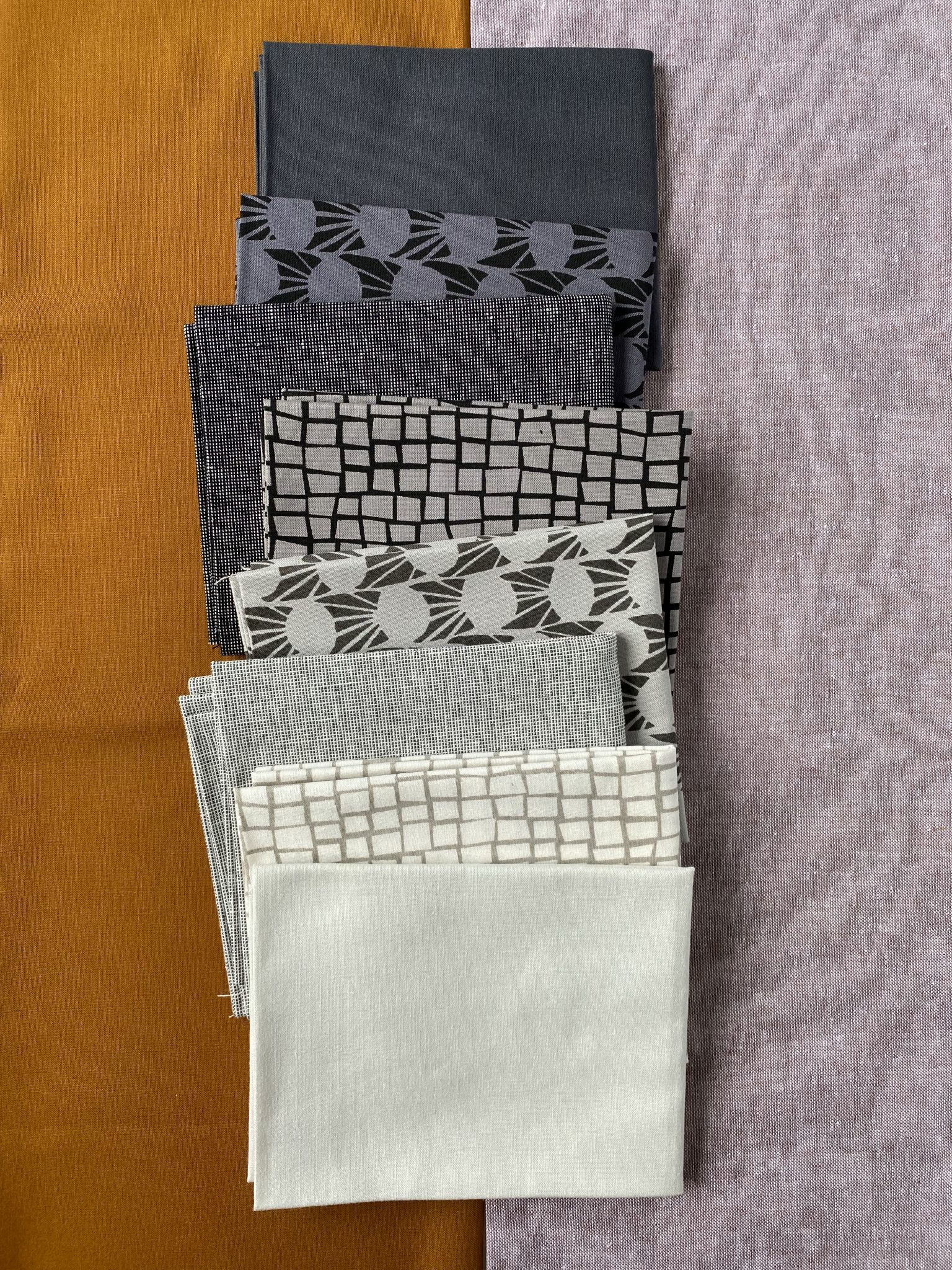
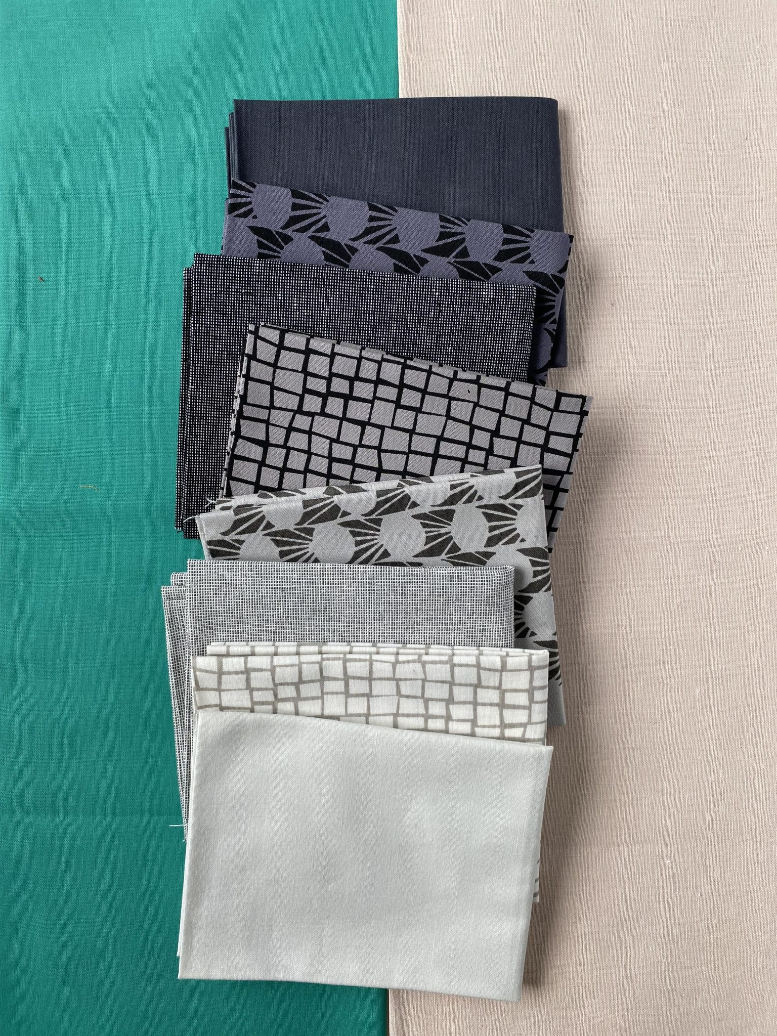
Fat Quarterly No. 5, from Keephouse X 3rd Story Workshop, features 8 fat quarters in a greyscale gradient and the Awaken quilt pattern. We wanted to show you how to showcase the 8 fabrics and have the tones really bounce off the two background colours that you might choose to go with them. The pattern will release independently from the FQ bundle on Feb. 3, 2022!
Here is how you can think about choosing these two colours:
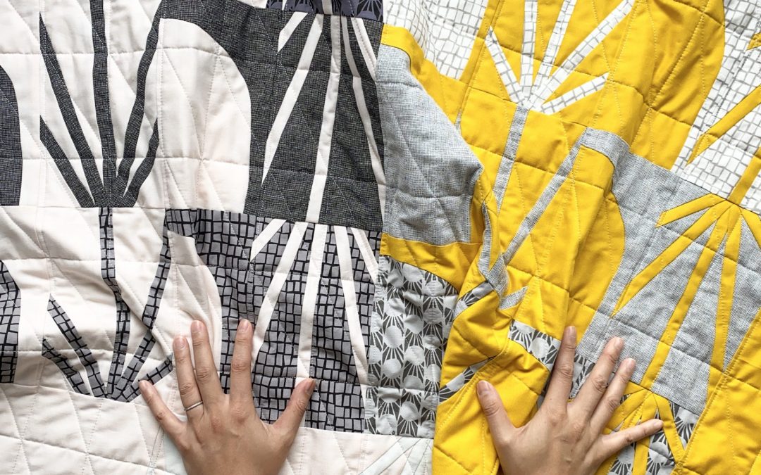
- SATURATION is the purity of colour that determines its brightness or dullness. Background #1 is a “stronger”, louder, more saturated colour.
- When you lighten or darken a colour with white or black, they become MUTED – the opposite of saturated. Background #2 is more muted and less saturated. (Find a more in-depth colour glossary here.)
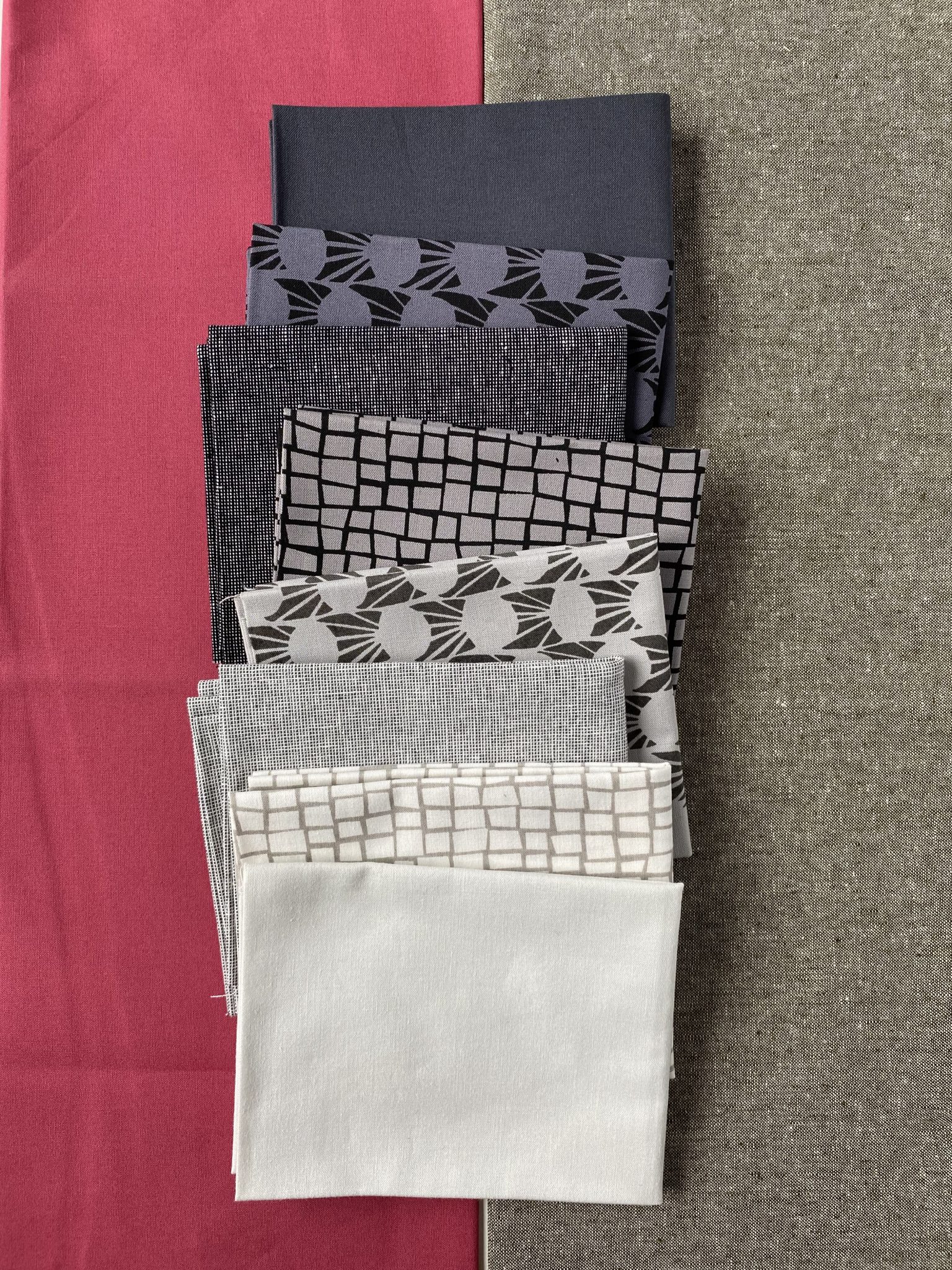
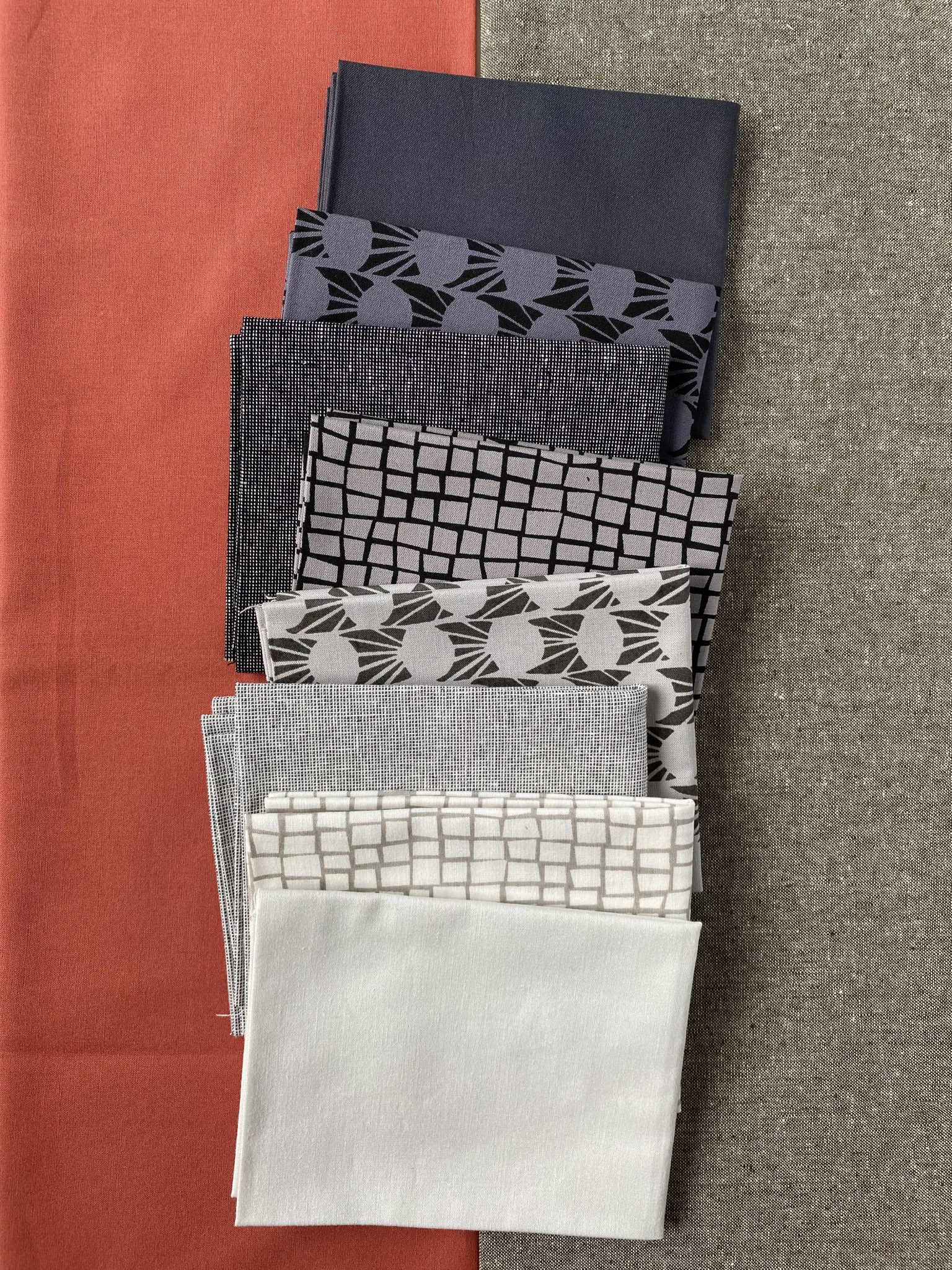
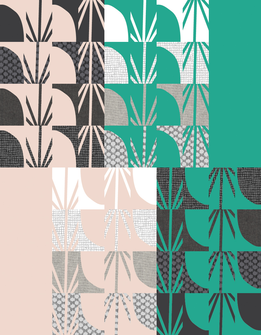
Here are some mockups to help you visualize the possibilities. (Disclaimer: Images are only representations of the fabric; actual fabric may differ from what appears here!)
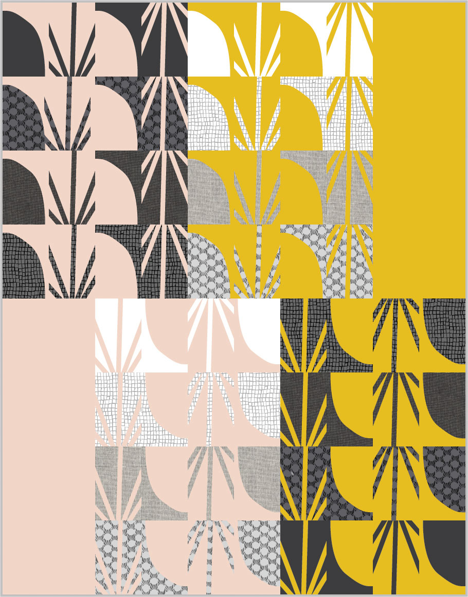
Sample quilt:
Background #1: Kona Grellow
Background #2: Kona Shell
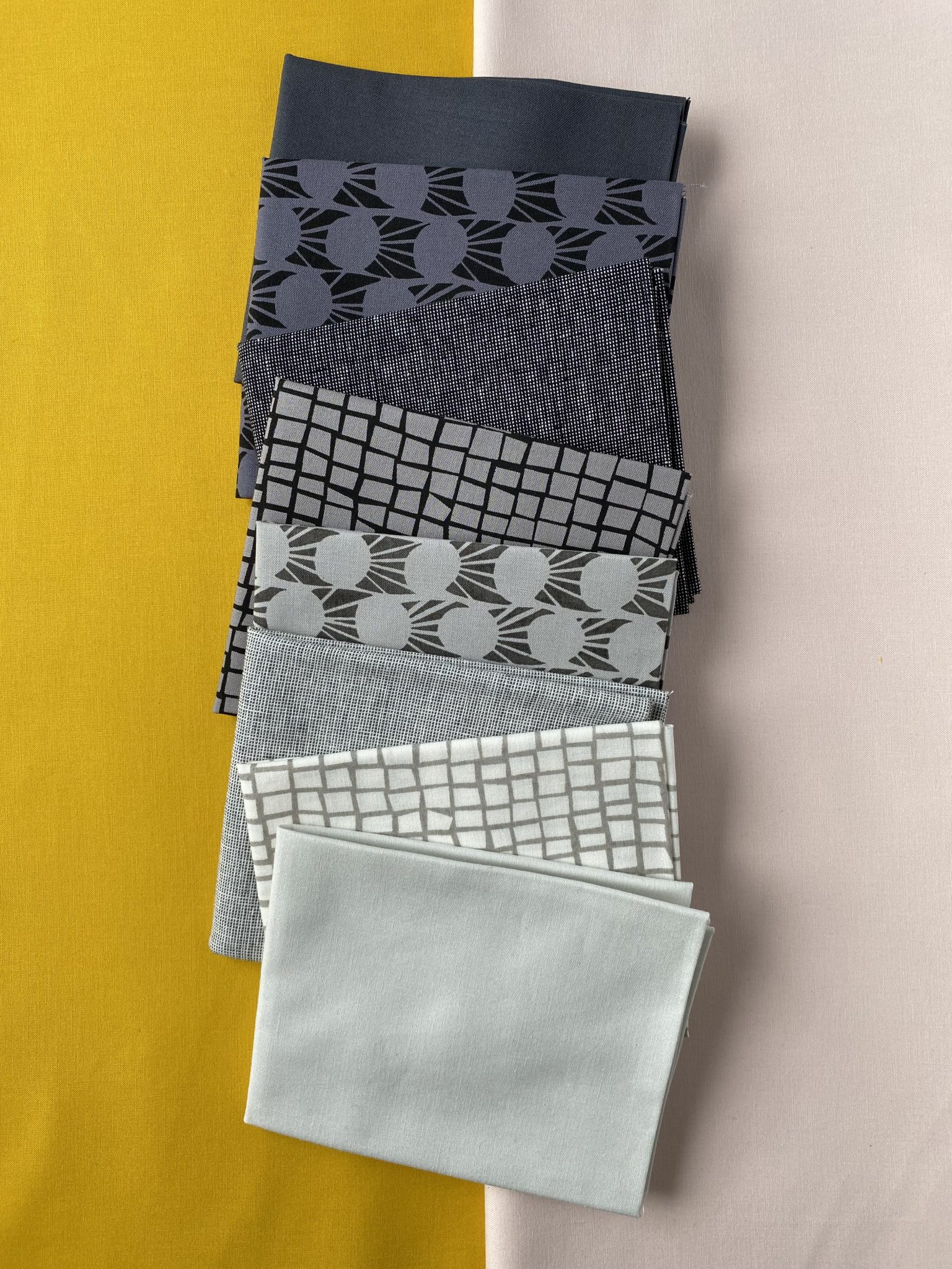
Background #1: Kona Salmon
Background #2: Essex Yarn-dyed Linen in Seafoam
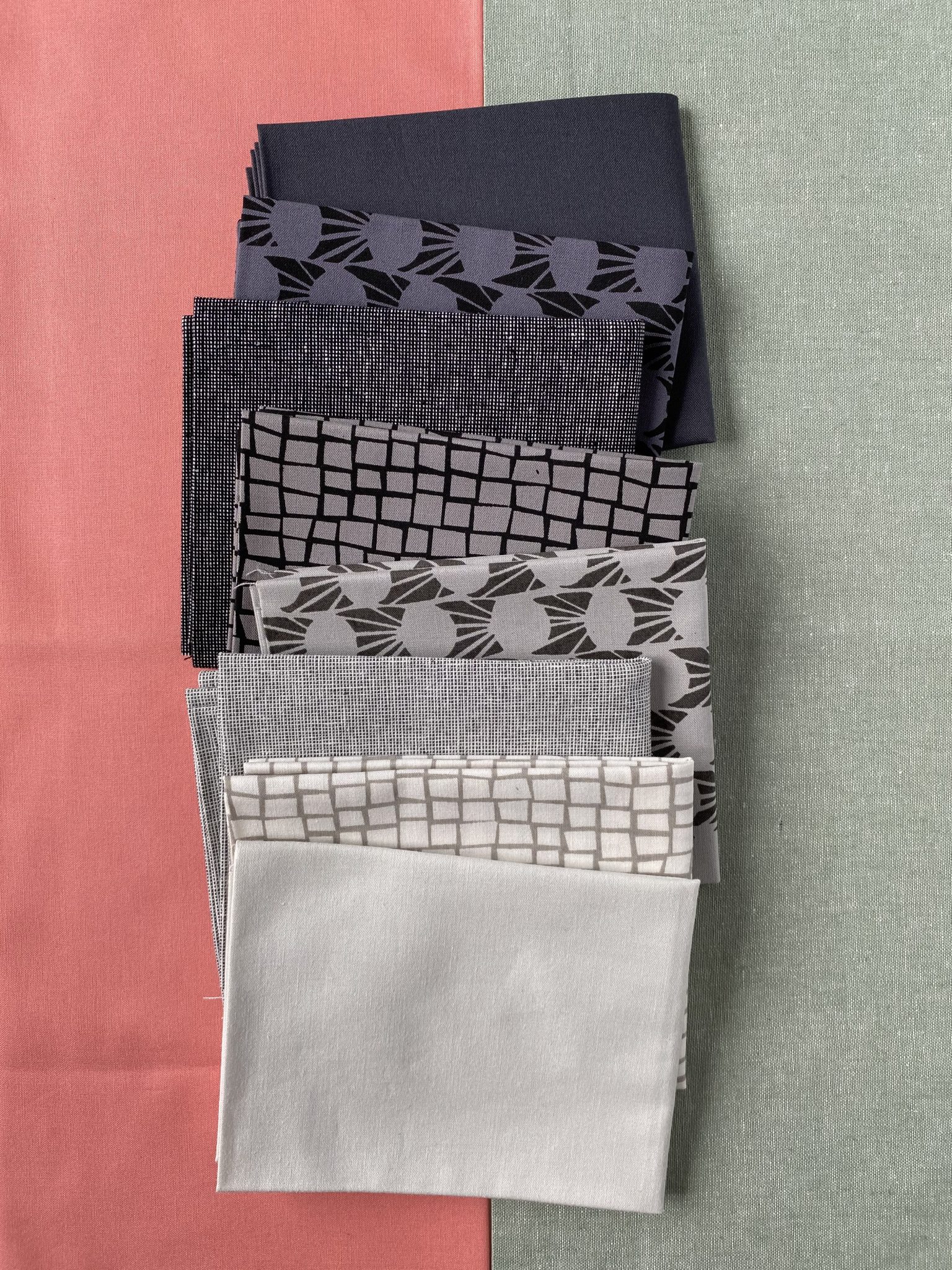
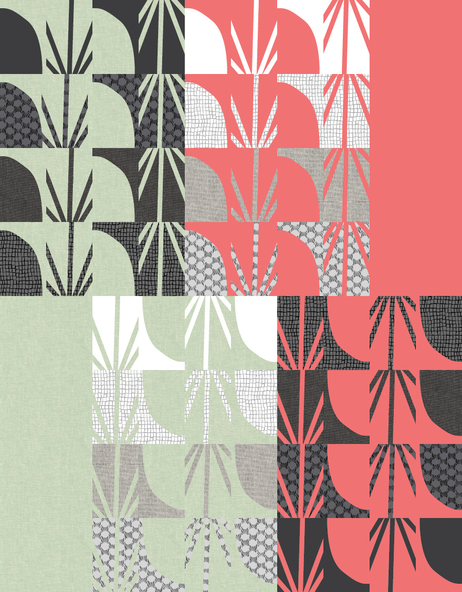
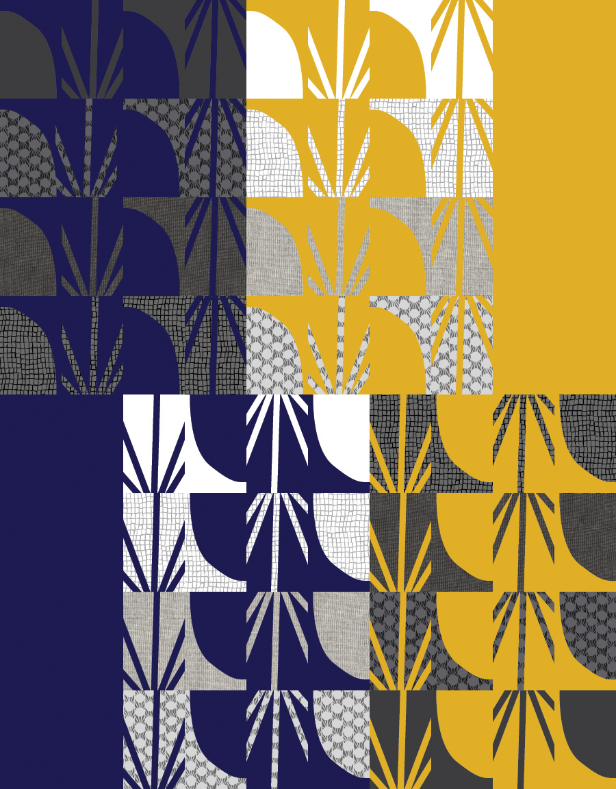
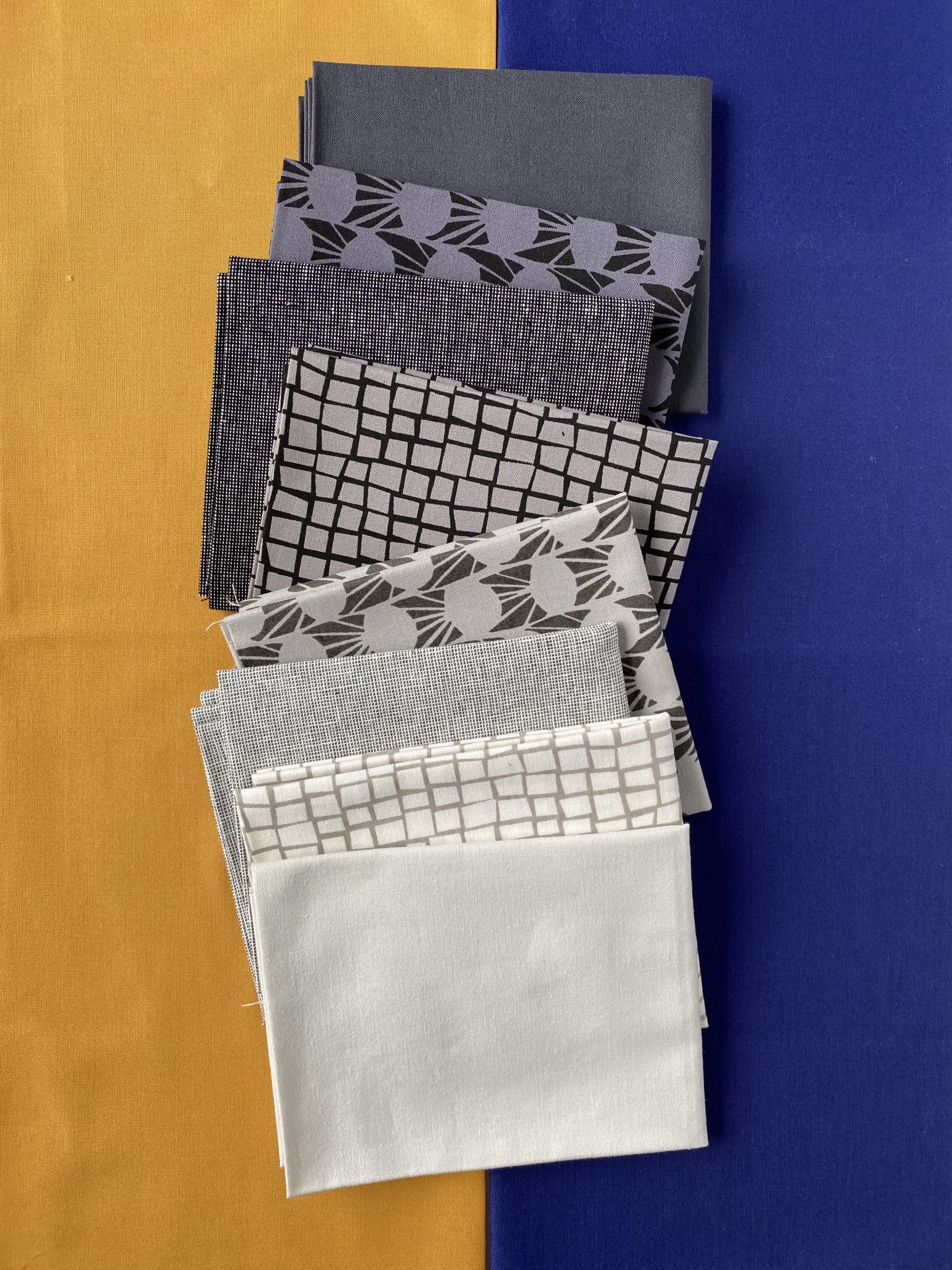
Background #1: Kona Yarrow
Background #2: Kona Nightfall
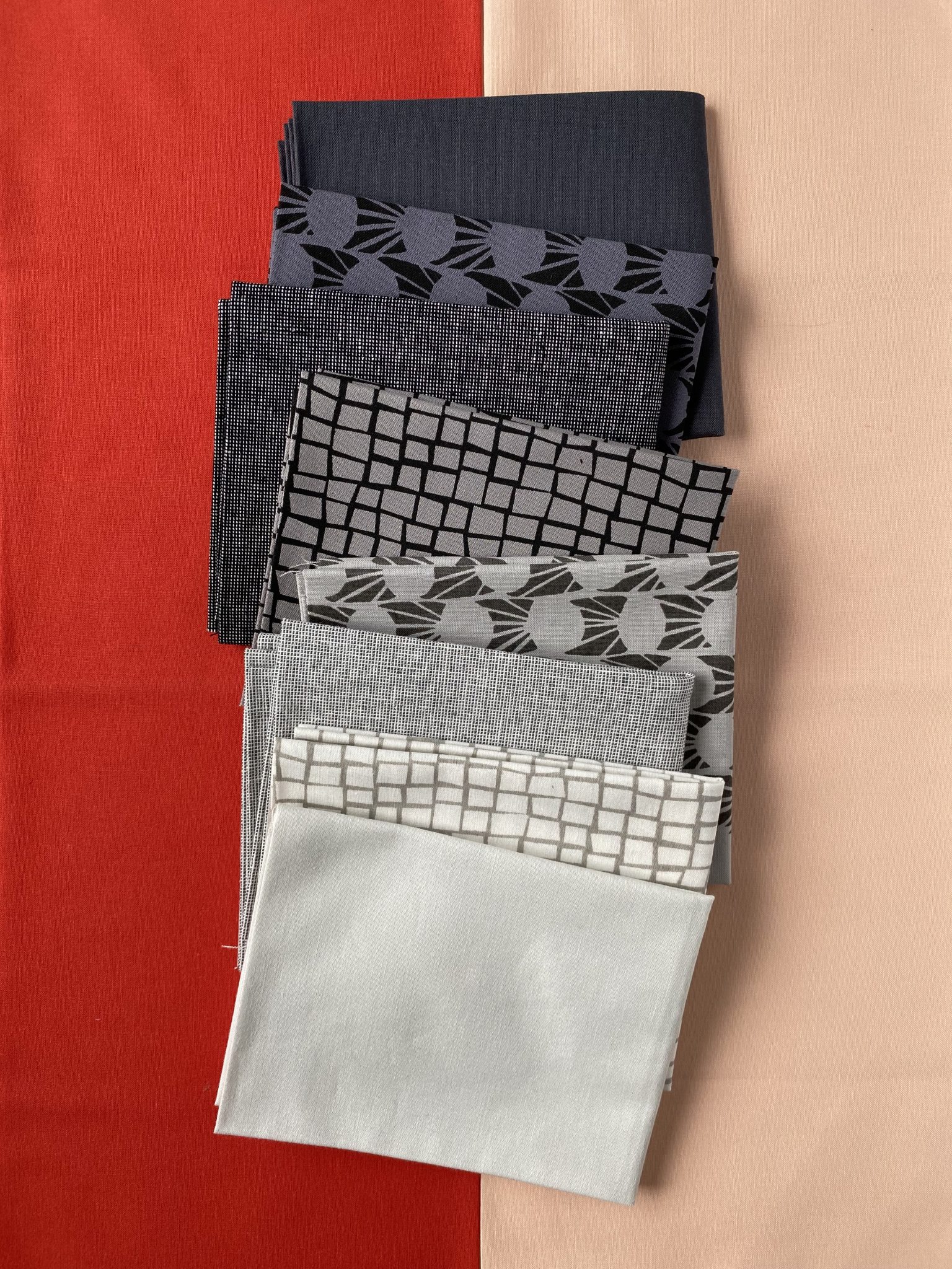
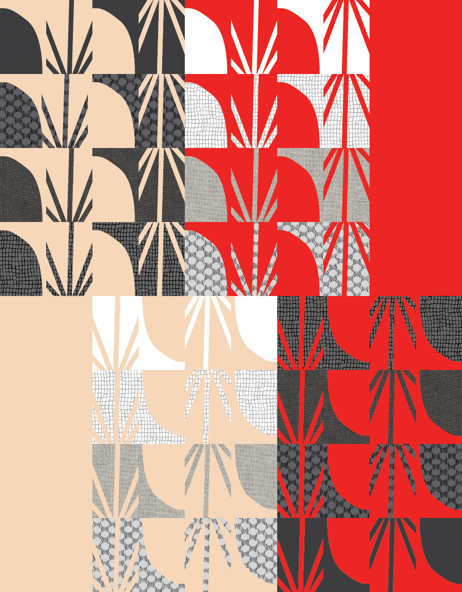
Background #1: Kona Pimento
Background #2: Kona Ice Peach
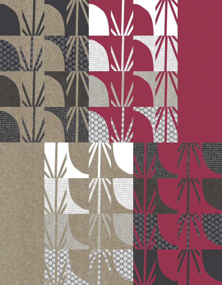
Background #1: Kona Deep Rose
Background #2: Essex Yarn-dyed Linen in Olive OR
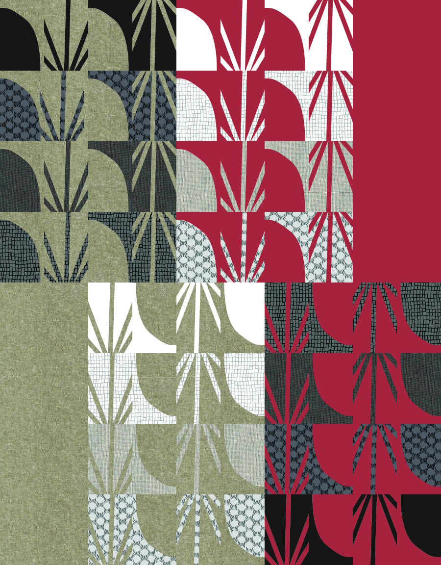
Background #1: Kona Sienna
Background #2: Essex Yarn-dyed Linen in Olive
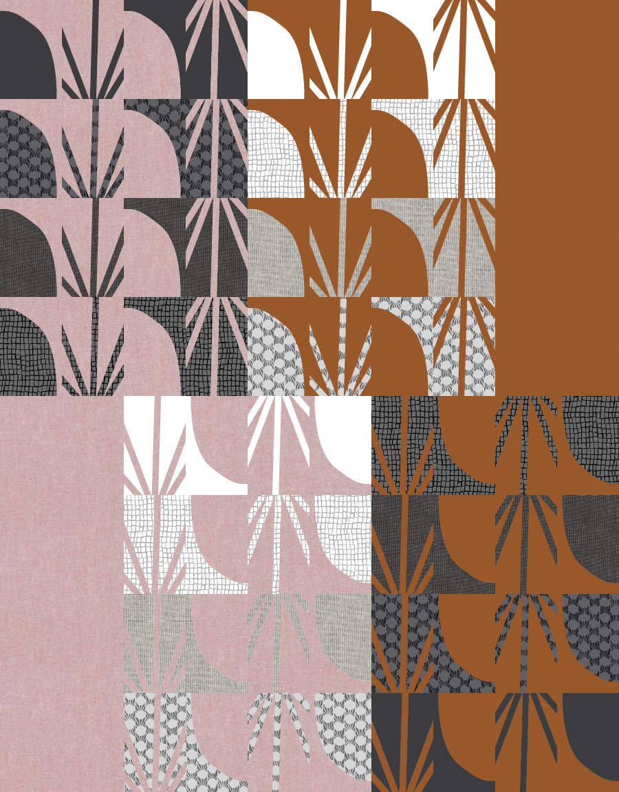
Background #1: Kona Roasted Pecan
Background #2: Essex Yarn-dyed Linen in Mocha
Background #1: Kona Bluegrass
Background #2: Essex Yarn-dyed Linen in Lingerie
The Awaken pattern is a gentle introduction to improv quilting — some mild loosening up within each block. The pattern includes links to video tutorials guide you through the process! I’m so excited to share this newest Keephouse X 3rd Story bundle and pattern with you. Enjoy!
Hello Andrea
Will the Awaken Quilt pattern be available on its own?
Thank you
Nilufer
Hi Nilufer! Nice to hear from you! It will be released later on on its own; likely in early 2022!
Love these suggestions! Any tips if going for a totally neutral vibe? Is there such a thing as a “saturated” neutral to use in place of the yellow ? I figure with going for a gray or taupe for the muted side.
My thoughts are a black or a white! Something stark.