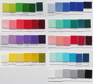
In the Cut Collection of paper piecing patterns, I include four colourways in Kona Cottons: green, purple, red, and yellow. They work best on a white, off-white, black, or near-black backgrounds. Except for the yellow, which works best on black or almost black. The rationale for all the colourways is this: Because the gemstones are transparent, they reflect the background colour.
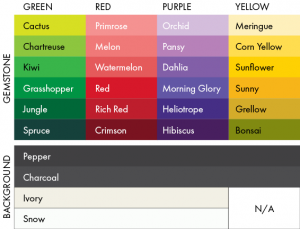
To help with the fabric selection, I used the Play Craft Palette Builder, which allows you to upload an image and it spits out Kona colours that come from pixels in that image. What a fabulous tool; I wish I knew about it when I was designing Crow Quills Analog four years ago! I cross-referenced it with my Kona Colour card to be sure that what I was seeing on screen was accurately represented in the fabric selection.
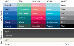
Below is a chart of five additional colourways for The Cut Collection of paper-pieced gemstones. The white is the exception in this set. Kona Snow is not recommended as a background, lest lightest shade of the colourway disappear into it.
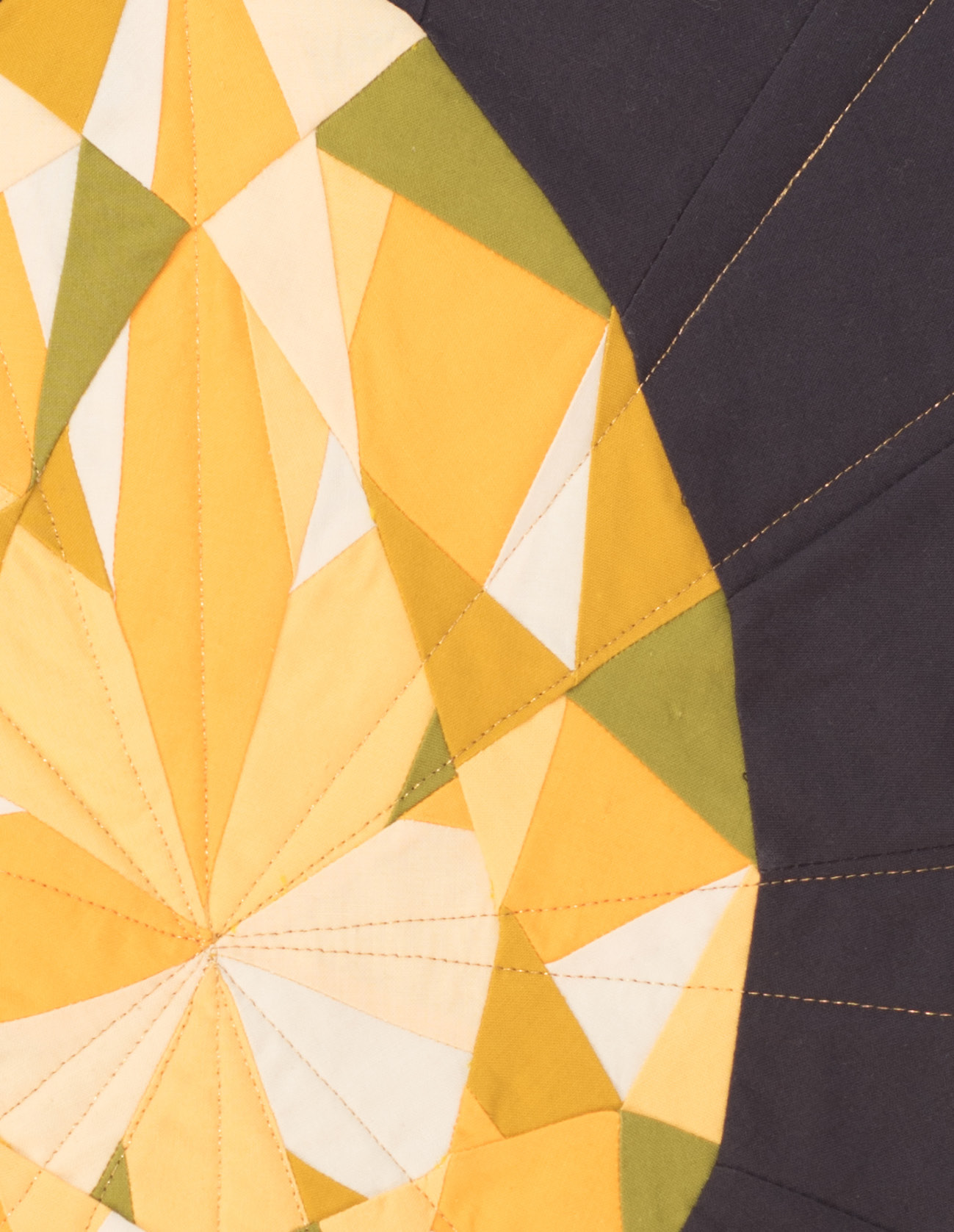
With the yellow colourway, you may notice the darkest shade is not even yellow; it’s green. That is the result of the black background being reflected into the stone, and then perceived by your eye to be green. When you “add” black to yellow, you will start to get a green shade.
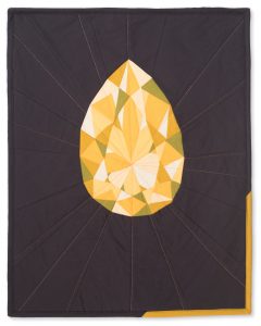
Topaz Gemology Quilted Poster, by 3rd Story Workshop. Photo: Deborah Wong.
Likewise, if I put a clear colourless stone, like a diamond, onto a coloured background, it will change the colours in the stone. The middle row of gems in the image below are all clear, colourless stones, but reflect their coloured backgrounds. Various tints emerge in the colour scheme. The bottom row of gems do not reflect any of their background colour; the result is a gemstone disassociated from its surroundings.
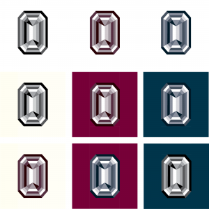
Emerald Cut. Top row: Three different coloured gems on white backgrounds. Middle row: Clear, colourless gems on various coloured backgrounds. Bottom row: Reddish gem on ivory, blue-ish gem on burgundy, clear gem on dark blue; none take into consideration the background colour.
If you would like to learn more about “adding” and “subtracting” colour, I highly recommend Josef Albers’ Interaction of Color. It brings one’s perspective on colour to a whole new level. Albers presents qualitative equations and proofs about colour to show you how you perceive; it will blow your mind. Or find some transparency inspiration on Pinterest.
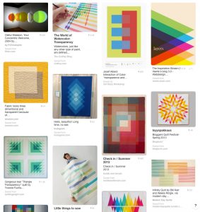
Transparency on Pinterest, by 3rd Story Workshop.
Thanks for this post, I love learning more about colour. And as per the newsletter/giveaway – my favourite colour is teal and I love the circle cut diamond and the emerald gemstones from your Gemology Collection
Colour is a very tricky thing, this is why digital technology will never be able to truly capture what the human eye sees. I love the blues and greens particularly in your emerald cut gem! Of course all of your work is amazing!
jade green and the diamond are amazing!!!
I love the round-cut in purple. This was an interesting read and something I have never really thought about before. Also, that Play Craft Palette Builder is pretty dang cool and I’m glad you linked to it! I think your gemstone paper piecing patterns would make a fun wall hanging with the birthstones of each family member! You do fabulous work!
Id have to say that my favorite color is blue. But the colors in your garnet / ruby are speaking to me these days so have to go with that gem as my fave 🙂
My favourite colour is green (the front door of my home is painted a shade somewhere between ‘cactus’ and ‘chartreuse’, inside and out!) and I have loved the emerald gemstone from your Gemology Collection since first spotting it at an Etsy show. It even inspired me to try out paper piecing myself 🙂
Wunderbar, wie Du eine Verbindung zwischen dem Diamanten und dem Hintergrund schaffst!
Aber ich mag die schwarz-weißen Diamanten am allerliebsten.
Liebe Grüße
Judy
Danke sehr, Judy!
This is so interesting and informative post for all. I am so inspired by your blog. Thanks for sharing this best post.
Admiring the commitment you put into your blog and detailed information you offer.
It’s nice to come across a blog every once in a while that isn’t the same unwanted rehashed information. Wonderful read!
Thanks!