Everyone’s Got an X features transparency, with translucent “white” stripes overlaid on a coloured bar on a darker background. First up, a couple of definitions and then we’ll get to how we can achieve this effect in our own versions!
- Transparent: allowing light to pass through so that objects behind can be distinctly seen.
- Translucent: allowing light, but not detailed shapes, to pass through; semitransparent.
Translucency is a degree: 100% translucent is transparent. Any degree of translucency is semi-transparent (not fully transparent).
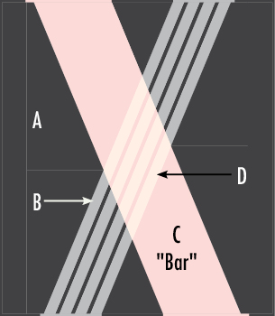
Everyone’s Got An X is composed of three layers:
- A background layer (Fabric A)
- An opaque coloured bar crossing from left to right/top to bottom (Fabric C)
- Four translucent white stripes crossing on top of the other two layers (Fabrics B and D)
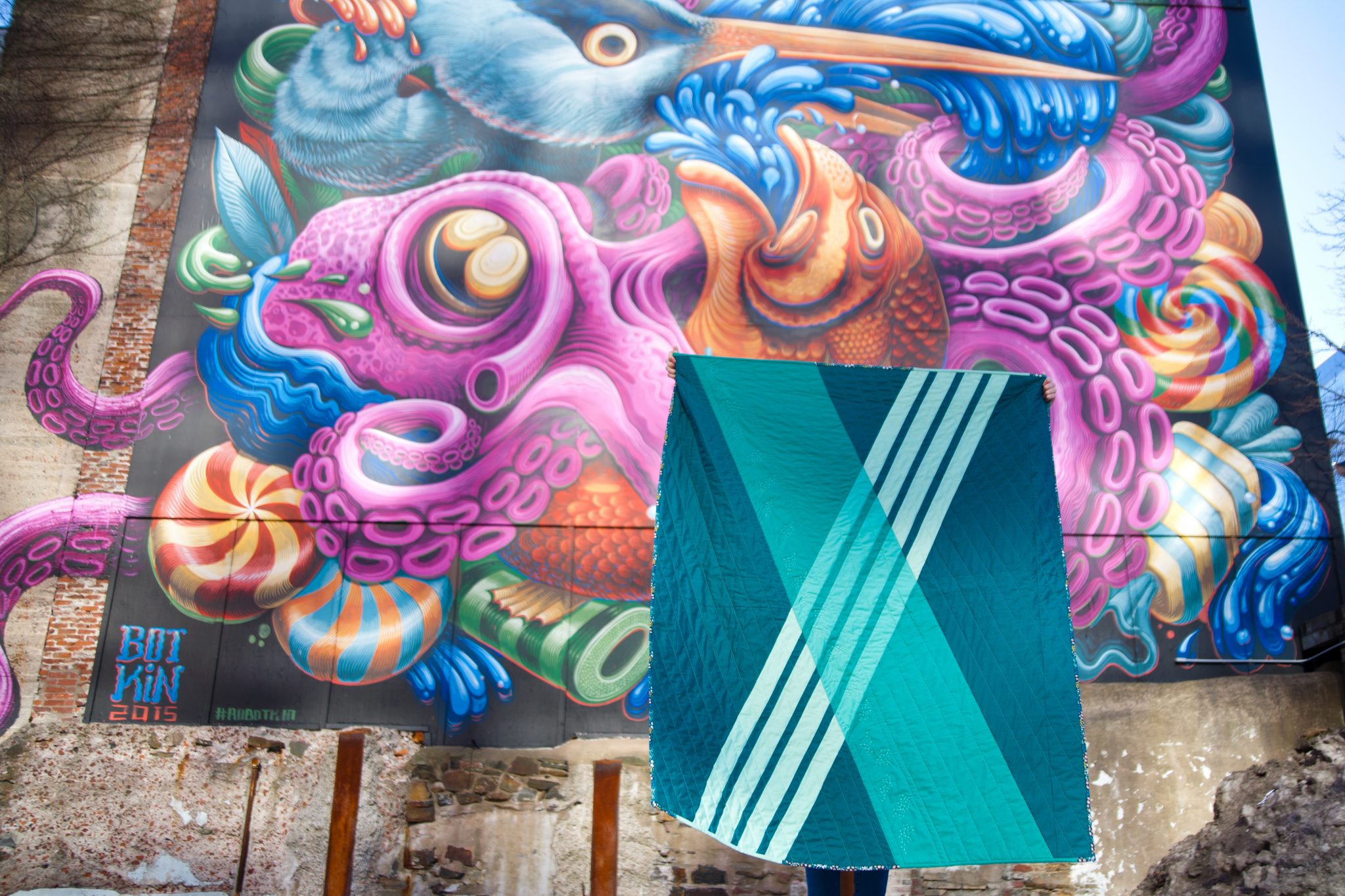
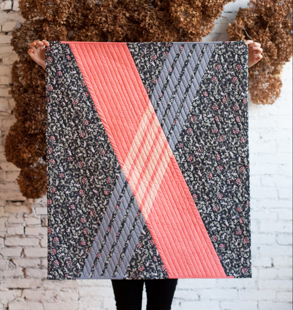
This effect is achieved with just four different fabrics! The first version used a dark grey background layer (A) and a pink bar (C). The transparent white stripes are, in fact, not at all white! They are made with a lighter grey (B) and a pale pink (D).
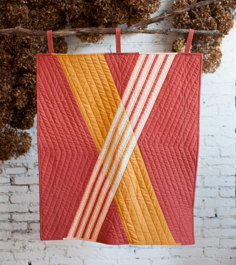
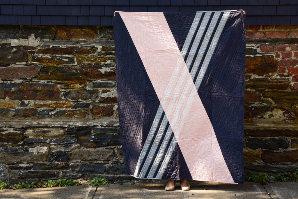
The same reasoning was applied to this earthen tone version above. You may be able to see that the “white” stripes are a bit stronger —meaning they are more opaque and less transparent. This means that they are quite pale in tone, with a starker contrast from the colours “behind” them.
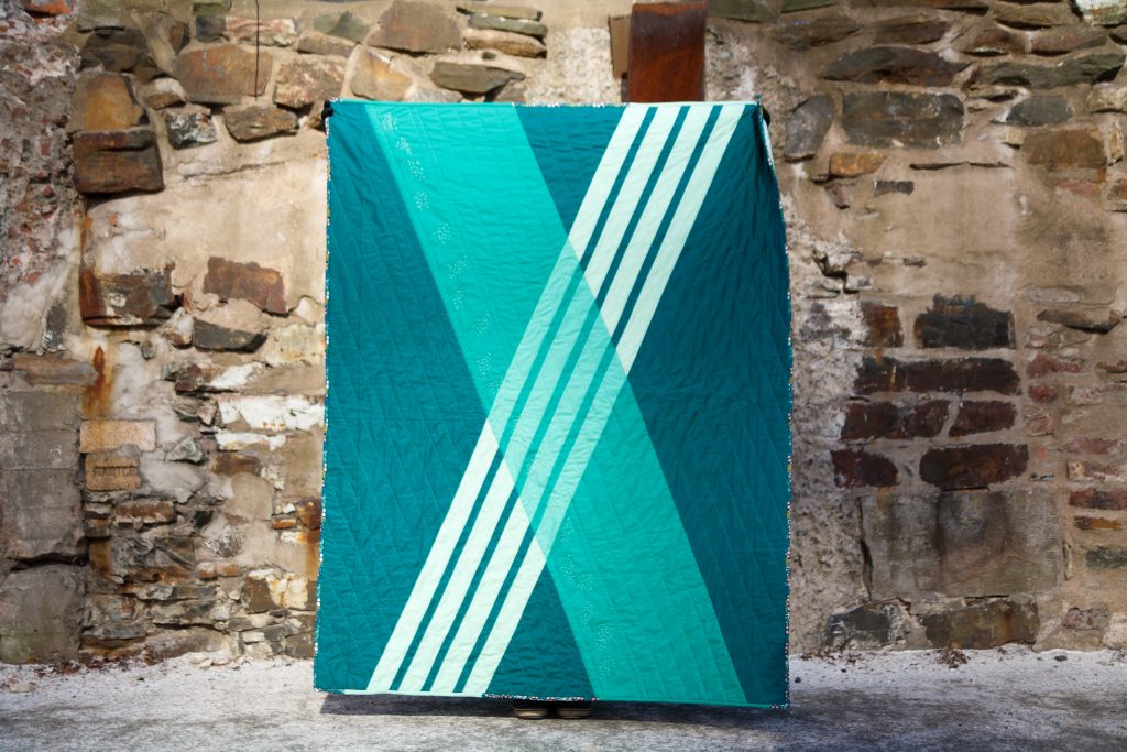
How about using prints? Here’s how I approached the fabric selection for the baby version above:
- I determined the background fabric first.
- Secondly, I picked a print from the same collection that contrasts the background. It reads as a blender (or “near-solid”).
- Lastly, I picked solids for the stripes — one that looked white stripes obscuring the background and bar.
This green one — it looks straightforward enough, right? A monochromatic version. But look closely here: What is going on with the layers? If you think about it as we have with the other examples — background, then bar and then stripes — it doesn’t work. However reordering the layers makes the colours make sense: The base layer is the dark teal, then the transparent white stripes are placed on top of that and lastly a translucent green bar lays on the very top. Josef Albers book Interaction of Color talks about this as “space” — even though we are only working in two dimensions.
Playing with the dominance of one colour over the other, the blue looks like it’s on the top layer (top image) vs under the green (bottom image).
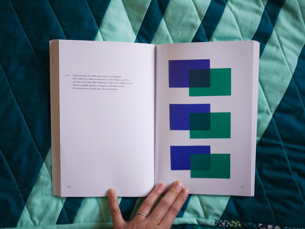
From Josef Albers’ Interaction of Color.
In the next post, I tackle coloured stripes in lieu of white stripes using digital tools to mock them up!