I work intuitively, organically, things just feel right. I like experimenting just to see what happens, but I also set boundaries for myself. – Lucy Engels

Lucy Engels is the creative hand behind SkinnyMalinkyQuilts. Located in Edinburgh, Scotland, Lucy is first and foremost a printmaker, screenprinting being her favourite process. She began quilting in 2013 after becoming an aunt: “Creating a quilt is like printmaking. Working in layers, adding texture, playing with colour. And obviously being able to print on fabric brings to two disciplines together.”
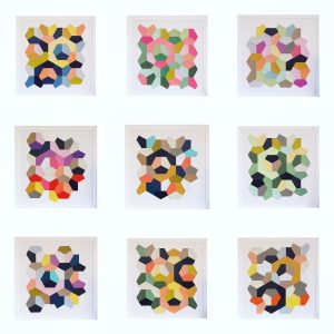
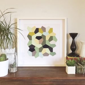
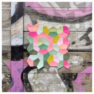
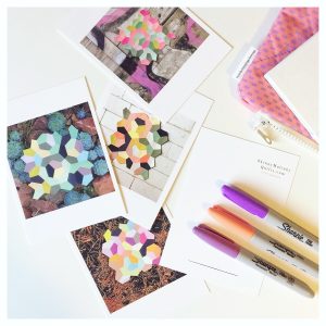
Lucy embarked on a series of 1/3 hexie English paper-pieced colour studies in the fall of 2016 and completed a set of ten “Quilt Prints.” Her aim was to explore colour and experiment with different photographic backgrounds; she came away with stunning results. “I love playing with a sophisticated palette whilst enjoying bold combinations.” When asked about her process, she found it hard to parse out her steps: “I work intuitively, organically, things just feel right. I like experimenting just to see what happens, but I also set boundaries for myself. Like with these [Quilt Prints], set shape, limit colour palette in each and only make ten.” Many of us have an intuitive sense of colour, but many of us don’t. I asked Lucy if I could break down some of her colour choices for others to see where her beautiful conclusions could be rooted. Below is a little colour analysis of three of her quilt prints, which will give you an idea of how these colour combinations work so well. And maybe even embolden you to make similar choices.
When we are looking at Lucy’s combinations, it’s important to note that she uses a lot of neutrals to give breathing room to her stronger colours. Black, white, taupe, cream – these all give some space to really let the colours sing. In the discussion of the colour palettes, we take these neutrals out of the equation to simplify how we think about them.
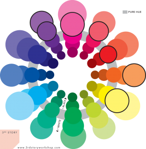
Analogous colours, saturated
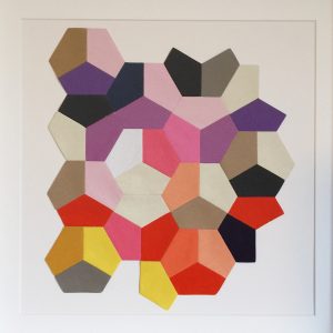
Quilt Print No. 3 is a pleasing sunset of colours, ranging from purple to yellow. As we can see on the colour wheel, the colour are an analogous set, meaning that they all sit adjacent to each other on the wheel. This gives it a very harmonious feel – like the colours are all related, because they are! Another noteworthy feature is that the colours are all quite intense. The colours that sit on the grey band — that is, the third circle from the centre in each hue set — are the most pure. There is no black or white in those colours; they are saturated. Notice that these colours are pure colours or sit close to the purest hue.
In contrast, Quilt Print No. 7 is muted. The colours are once again analagous – greens and yellows, a hint of blue that are next to each other on the colour wheel. The difference here is that they move away from the purest hue. Some of the greens are quite dark and some are very light, but none are very green.
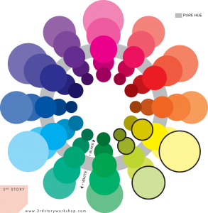
Analogous colours, muted

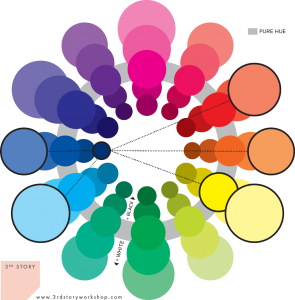
Complementary colours, contrasting tones
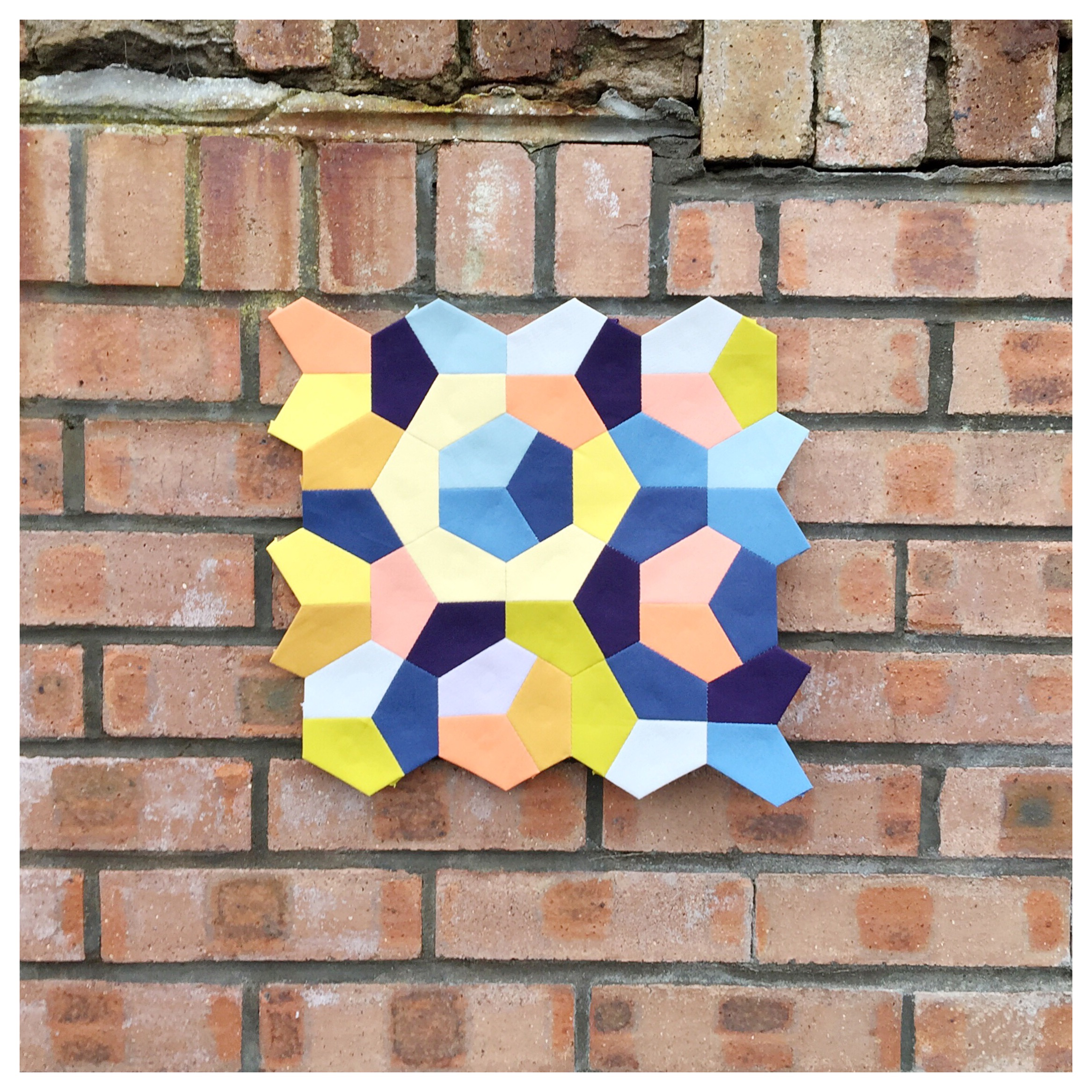
Next, we have a complementary set of colours in Quilt Print No. 9. The blue and orange/yellow hues sit across from each other on the colour wheel. The darkest tone is navy, which anchors the lighter tints of blue and pale peach and yellows. This contrast in tone helps to define the composition; the dark colour breaks up the very even tone across the lighter colours. The black in Quilt Print No. 7 above functions in the same way.
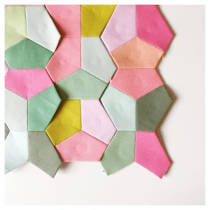
 Lastly, Quilt Print No. 10 was inspired by the 2017 Kona Colour of the Year, Pink Flamingo. Lucy chose a lovely set of greens in this spring-like colour scheme. This complementary set is explored in my first colour post about Kona Pink Flamingo and Pantone Greenery.
The Quilt Prints are available as original pieces and printed postcards Lucy’s shop, SkinnyMalinkyQuilts. You can find the full list of Kona solids that she used on her blog.
I absolutely love your site.. Pleasant colors & theme. Did you develop this web site yourself? Please reply back as I’m planning to create my very own website and want to know where you got this from or what the theme is named. Thank you!
Hi Jeneva, The site is a modified WordPress site using the theme “Sela.” I hired a web designer to help me modify it to my preferred functionality and design.