Happy New Year! The Lunar New Year was just passed so even though it’s the end of January, it’s a totally legit greeting. This is the first post in series highlighting colour duos and palettes. Although this blog is geared toward quilters, each of these colour posts will include some basics of colour theory for any budding designer or artist. First up, pink and green – specifically, the 2017 Kona Color of the Year: Pink Flamingo with the 2017 Pantone Color of the Year: Greenery.
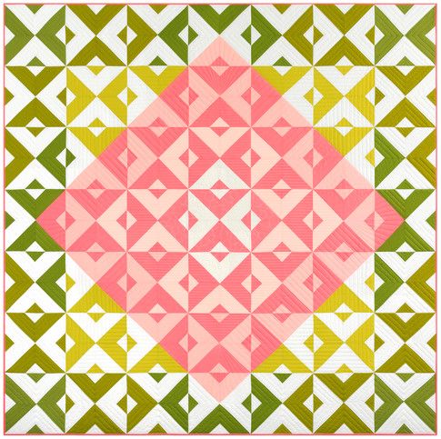
Diamond Tiles by Robert Kaufman Fabrics. Free pattern available in March 2017.
In late December of each year, the [quilting] world eagerly awaits the announcement of the Kona Color of the Year, which is a limited-edition solid “based on input from a selection of trend-setting designers and top industry taste-makers, along with extensive market research, color analysis and trend forecasting.” I’m not sure what that process looks like from a practical point of view, but I believe Robert Kaufman. Last year’s Kona Highlight was a neon shade (check out fall Quilt Market’s special exhibit of minis from various designers) and this year’s is quite bright as well. Pink Flamingo – a telling moniker – is a peachy pink that evokes tropical warmth, something I know nothing of at this time of year in Atlantic Canada.
With a broader audience, the Pantone Institute announces the Color of the Year as “a symbolic color selection; a color snapshot of what we see taking place in our global culture that serves as an expression of a mood and an attitude.” Designers from all disciplines pay attention; then proceed to either embrace or ignore. The Pantone Institute’s 2017 Color of the Year represents “evokes the first days of spring when nature’s greens revive, restore and renew…. A life-affirming shade, Greenery is also emblematic of the pursuit of personal passions and vitality.” To me, it evokes a food court salad bar logo. My personal associations aside, its connotations include life, sustainability, health, parks, freshness, and consumer choice. This limey green is a perfect pop of colour in a neutral room. I seem to have many kitchen thing-a-ma-bobs in a similar shade by Joseph Joseph. Why does Greenery work so well with Pink Flamingo?
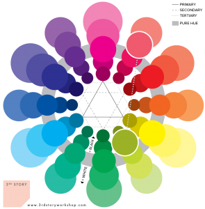
Kim Eichler-Messmer’s MQG webinar on colour theory reminded me that a CMY (cyan, magenta, yellow) colour wheel, rather than the RGB colour wheel you remember from elementary school is the way to go. It doesn’t lie (be honest, red and blue paint gave you some very ill-looking shades of purple-brown when you were young) and it gives you more pleasing colour combinations. It’s actually what inks your inkjet printer uses to give you every shade in the rainbow. In the image above you can see that pink and green sit directly across from each other, making them complementary colours. Bright and cheery, these are happy playmates. Think Kate Spade fuchsia with the signature Kate Spade green.
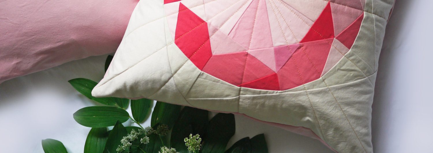
Pink Flamingo and Greenery are similar tones of colour; that is, their brightness is about the same. For those of us that get stressed by clutter and visual noise, this colour combo could make you anxious or blind you. One can consider breaking it up with a neutral white or muted tones, as with the Robert Kaufman Diamond Tiles design up top. This way of treating similar tones of colour “gives your eye a place to rest,” as we often say. Breathing room.

 As you can see in the tonal scales above, another consideration is changing the relationship between the colours. Instead of similarly saturated colours, we can play with their tones. For the more subdued palettes that I personally prefer, I like to take cues from interior design. Turn down the green, and mute the pink: Dark green and blush pink. This adds contrast and almost gives the green a neutral role. Apartment Therapy has even deemed emerald-coloured sofas “the new navy” (gasp!).
Until now, I thought that pink quilts – and pink and green quilts, for that matter – were reserved for little girls. Now having seen designs from Elizabeth Hartman, Heather Jones, and Darlene Zimmerman, it’s a whole new world. I have been off Pinterest for quite awhile, but recently just picked it up again – holy, inspiration! Paintings, photographs, interiors – pink and green can be sophisticated, moody, and bright all at the same time.

Kona Pink Flamingo / Pantone Greenery on Pinterest by 3rd Story Workshop.