My love for navy blue is right up there with my love for grey, black, and white. I imagine that it will adorn my living room or bedroom walls someday. What is special about navy is that it’s an actual colour; I surprise my architect self with this preference. What puts it into this category of favourite? And what does the addition of gold do to elevate it?

A nostalgia settles in when I think about this colour combination. My 16-year-old self imagines a romantic “Starry Night” by Vincent van Gogh while reading a Pablo Neruda poem from Twenty Love Poems and a Song of Despair:
Oh, the teenage angst. (In fact, that last line was quoted in the series finale of Dawson’s Creek. Anyone remember that?)
Let’s start with navy. This colour really permeated my world when we moved to the East Coast. It’s often paired with white for a nautical feel, often with a lobster red thrown in as well. The thing about navy that gives it an advantage over black is its hygge-ness. Hygge (pronounced “hoo-gah”) is the Danish word with an approximate equivalent in English “cozy.” It derives from a 16th-century Norwegian term that also is the root of the word “hug”. From the new definition from the Oxford Dictionary, “a quality of cosiness and comfortable conviviality that engenders a feeling of contentment or well-being”. (More on hygge in this New Yorker article.)
Black can be stark, which often is my aim. However, there is a softer feel to the navy hue, making for a cozy, hygge-type warmth. Black represents an extreme purity in its lack of colour and light; navy has a humanness in that it leans toward imperfection. Navy is a warm neutral, close enough to being perfect that it’s even more close to being perfect than black in certain contexts. (Navy is the new black, don’t you know?) I love navy.
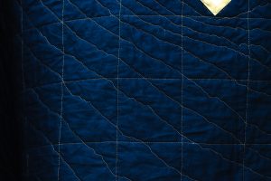
Gold quilting lines. Gold thread likes to break, but my affinity for this subtle shimmer outweighs the frustration. Photo: Naomi Hill.
So what’s my deal with gold? It’s also a warm neutral! The colours of natural materials – blond wood, metallics, walnut wood – fall into a neutral palette with ease. When paired with navy, gold gives sharp contrast in tone without adding too much colour.
 When I first started using Pinterest in 2012, one of my very first pins was a colour palette that I name “Lemon to Midnight.” It sat on my ‘colouring’ board for four years until the perfect project came along.
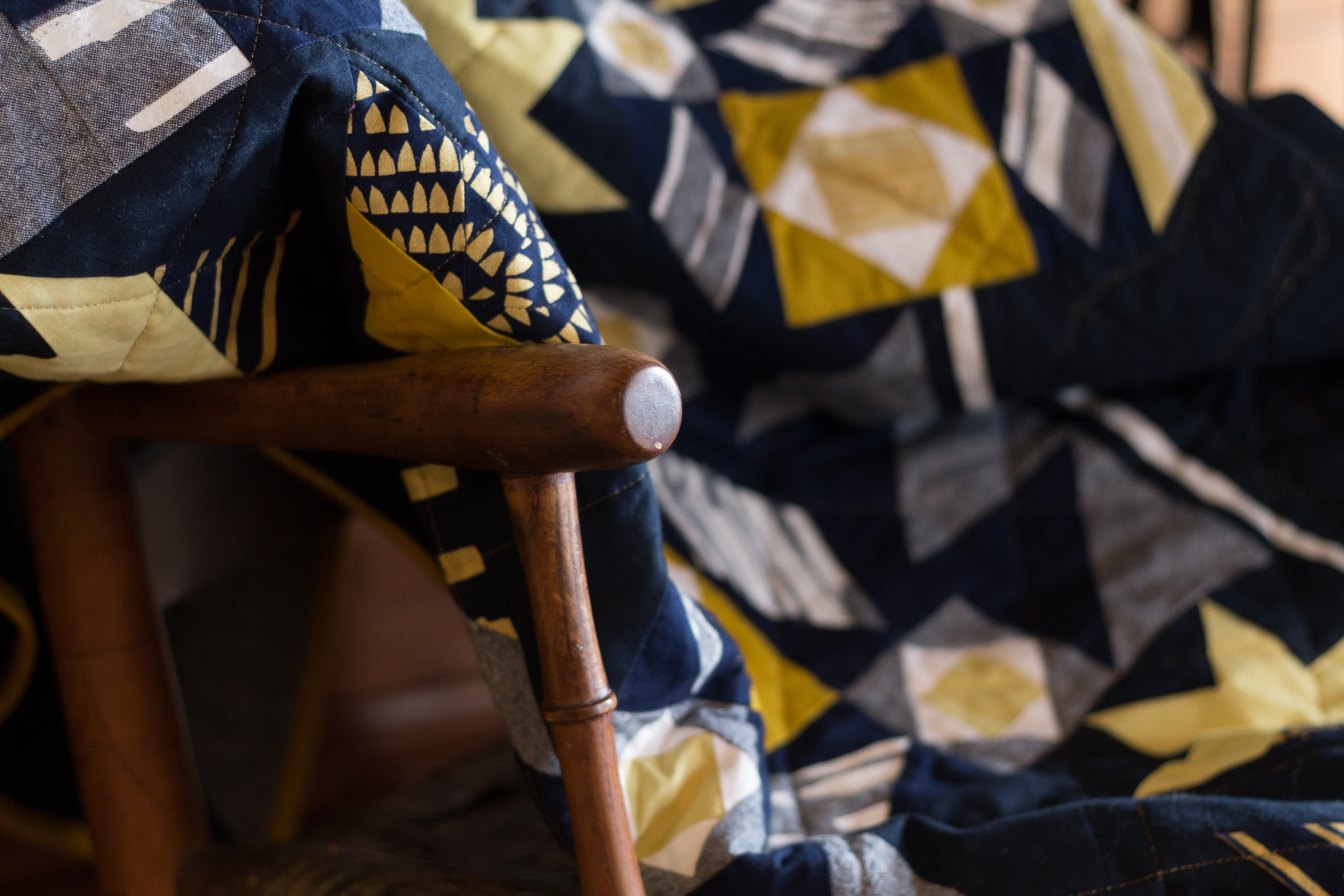
The perfect project ended up being the Land & Sea quilt, a collaboration with Keephouse Studio. We picked a navy fabric (Kona Indigo) as a background for Alissa’s prints in gold ink.

Photo: Naomi Hill
Fabrics with metallic prints are becoming more common now, but in times past, gold made appearances in spandex and prom dresses. We often consider yellow to be a matte approximation of gold, in the range of golden yellow to mustard. Yellow is tricky as a hue. As the tone darkens it often turns brown. Add black to darken it and it turns green, often losing its warmth. There are actually fewer shades of yellow than other colours in the spectrum.
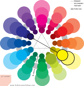
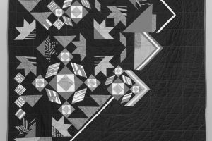
The key to the navy and gold/yellow combination is contrast. Navy and yellow sit across from each other on the colour wheel. One is a dark, near-black tone and one is a light to medium tone, as you can see from the black and white photo of “Land & Sea” below.
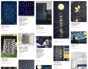
Beauty, calm, serenity, angst, hope — the range of emotions that navy and gold represent is vast. It makes it oddly versatile. There is no shortage of inspiring ways to use this striking, but comfortable colour palette. Find more on my Pinterest board.

Trackbacks/Pingbacks